
Functional Skills: Pie Charts
Pie Charts
Pie charts are a way of displaying data in a different way. They are circular and are divided into different parts.
The size of a section represents how much or how many of something there is.
Understanding Pie Charts
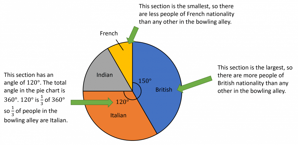
The pie chart below shows the nationalities of people in a bowling alley.
The size of each section shows the proportion of people with that nationality.
Follow Our Socials


Follow our Facebook for community support


Follow our Instagram & TikTok for revision help
Our Facebook page can put you in touch with other students of your course for revision and community support. Alternatively, you can find us on Instagram or TikTok where we're always sharing revision tips for all our courses.
Follow our socials for revision tips and community support
Drawing Pie Charts
To draw pie charts, you need to to work out the angle of each section.
Then, you need to draw the circle using a pair of compasses and fill in each section using a protractor.
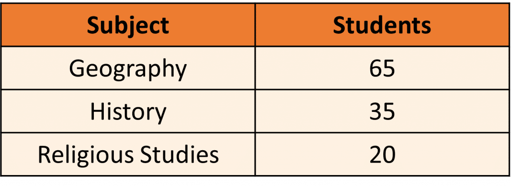
Example: Students in a year group are asked to pick a subject to continue studying.
The table shows these results.
Draw a pie chart to display this data.
The pie chart will need three sections – one for Geography, one for History and one for Religious Studies.
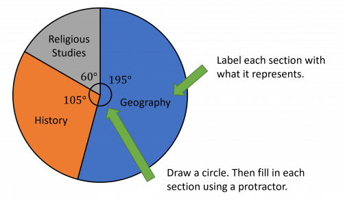
Divide by the total number of students, to find out what angle represents one student:
Find the angle for each subject by multiplying the angle for one student by the number of students who chose that subject:

Then draw a circle and fill in each section using a protractor to create a pie chart.
Label each section with what it represents.
Functional Skills: Pie Charts Example Questions
Question 1: A child is looking at the different types of vehicles in a car park.
They draw the following pie chart.

a) Which type of vehicle does the child see the most of?
b) What fraction of vehicles were motorbikes?
[3 marks]
a) The largest section is the ‘car’ section. Therefore the type of vehicle that the child saw the most of was a car.
b) The total angle in a circle is .
is taken up by the motorbike section.
Therefore, the fraction of vehicles that were motorbikes is
Question 2: The manager of a cinema is looking at the ages of visitors in screen 1 and screen 2.
They represent this data in the pie charts below.

a) In which screen are adults the most common age group?
b) The manager thinks that of people in screen 1 are children. Are they correct?
c) What fraction of people in screen 2 are students?
[5 marks]
a) In screen 2, the adults are the most common age group.
b) Yes, they are correct.
The angle for the children section is and
c) The angle for the student section is
Question 3: The table below shows the type of pasties that a bakery has sold in an hour.

Draw a pie chart for this information.
[4 marks]
per pasty.
So, we can complete the table, by multiplying the number of pasties in each row by :

Then, using a pair of compasses and a protractor, we can draw the pie chart, making sure to label the sections.
Specification Points Covered
L1.27 – Represent discrete data in tables, diagrams and charts including pie charts, bar charts and line graphs