
Functional Skills: Line Graphs
Line Graphs
Line graphs can be used to show the relationship between two groups of data.

Understanding Line Graphs
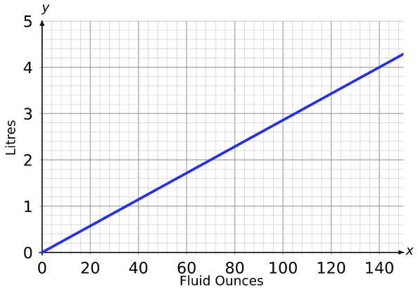
Example: The line graph to the right shows the relationship between litres and fluid ounces.
Change litres into fluid ounces.
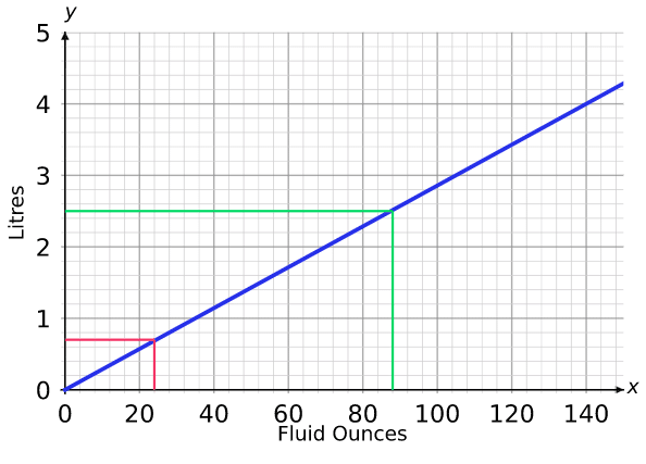
Step 1: On the vertical axis, start from and move across until you hit the line.
Step 2: From here, move downwards until you hit the horizontal axis.
Step 3: Read off the value where you hit the horizontal axis. This is the answer.
So, litres fluid ounces.
You can also change fluid ounces into litres, e.g. fluid ounces litres.
Follow Our Socials


Follow our Facebook for community support


Follow our Instagram & TikTok for revision help
Our Facebook page can put you in touch with other students of your course for revision and community support. Alternatively, you can find us on Instagram or TikTok where we're always sharing revision tips for all our courses.
Follow our socials for revision tips and community support

Drawing Line Graphs
To draw a line graph, you need to choose what the axes will represent, choose a scale for the axes and plot the points.
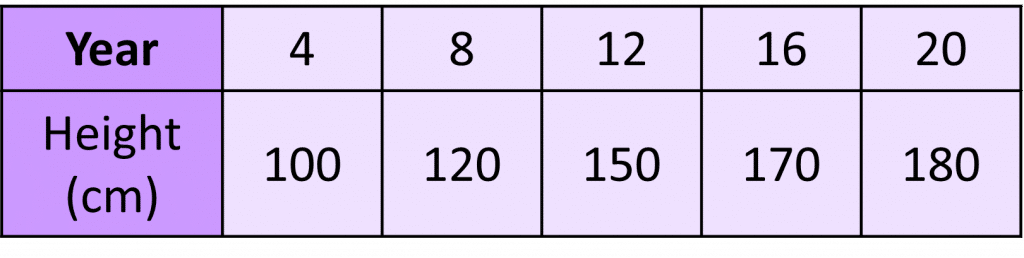
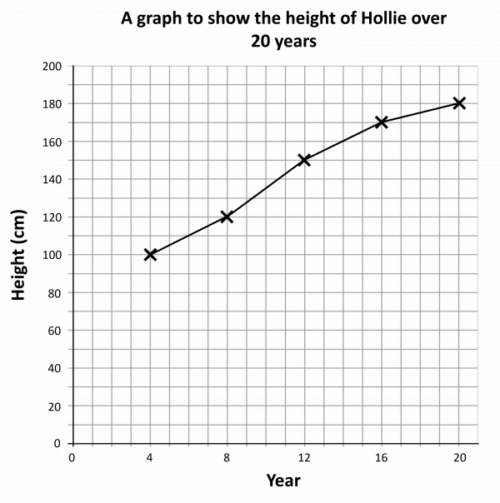
Example: Hollie’s height has been recorded over a year period. The results are recorded in the table.
Display this data on a line graph.
The line graph will need to show the year and the height on separate axes.
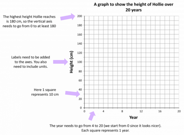
Then, plot the points on the grid, e.g. for year go up from on the horizontal axis until you reach on the vertical axis. Draw a cross or a dot here. Repeat this for all data.
Finally, join up the points with straight lines.
Completing Line Graphs
For Entry Level 3, you will be given an incomplete line graph and/or table and have to finish them off.
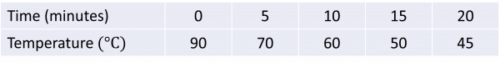
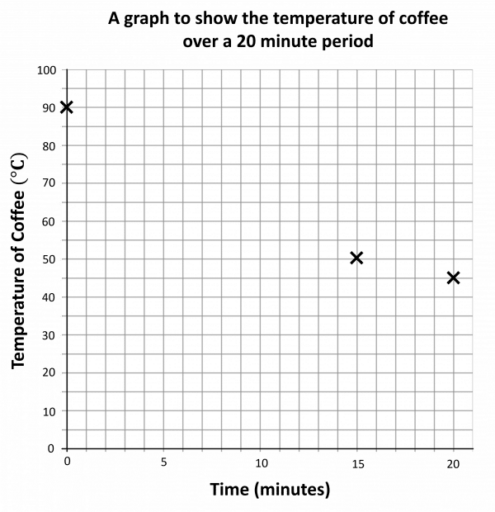
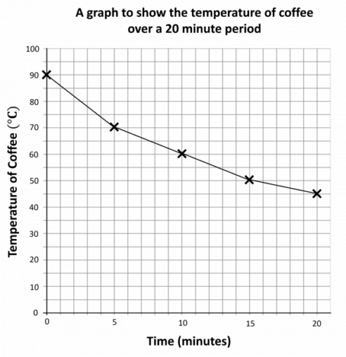
Example: Here is an incomplete line graph of the temperature of a mug of coffee over time, as well as the table of results it was plotted from.
Complete the line graph.
We need to plot a cross at minutes and , and another cross at minutes and .
Then, join up all of the points with straight lines.
Functional Skills: Line Graphs Example Questions
Question 1: The graph below can be used to change between kilometres and miles.
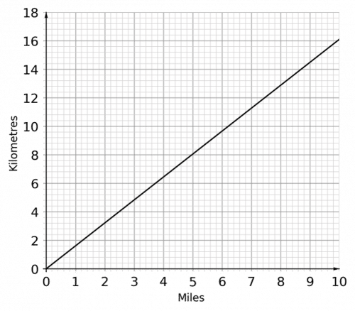
a) What is kilometres in miles?
b) What is miles in kilometres?
[2 marks]
On the vertical axis, small square represents kilometres.
On the horizontal axis, small square represents miles.
a) kilometres miles
b) miles kilometres
Question 2: The graph below can be used to change between litres and pints.
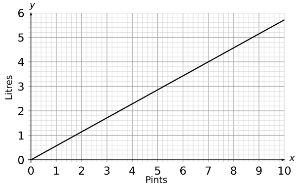
a) What is pints equal to in litres?
b) What is litres equal to in pints?
[2 marks]
On the vertical axis, small square represents litres.
On the horizontal axis, small square represents pints.
a) pints litres
b) litres pints
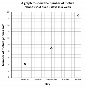
Question 3: A technology company records the number of mobile phones they sell over days in a week.
They record the results in the table below.
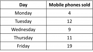
Draw a line graph for this data, making sure to clearly label your axes.
[4 marks]
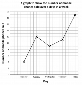
Here, we will make square represent mobile phone sale on the vertical axis and days of the week separated by squares on the horizontal axis.
We will also label the axes and give the chart a title, to describe what the chart is showing.
Your completed line graph may look something like this:
Question 4: A technology company records the number of mobile phones they sell over days in a week.
They record the results in the table below.
They partially draw a line graph, seen below.
Complete the line graph.
[3 marks]
We need to plot a cross for Tuesday at , and for Thursday at .
We then need to join up the points with straight lines.

Specification Points Covered
EL3.21 – Extract information from lists, tables, diagrams and charts and create frequency tables
EL3.22 – Interpret information, to make comparisons and record changes, from different formats including bar charts and simple line graphs
EL3.23 – Organise and represent information in appropriate ways including tables, diagrams, simple line graphs and bar charts
L1.27 – Represent discrete data in tables, diagrams and charts including pie charts, bar charts and line graphs